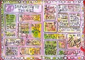
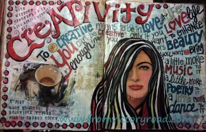
Your signature on a check or contract says that it is indeed YOU who is taking part in this transaction. Handwriting analysis is about what your writing- in your own personal style – says about YOU. There is nothing more appropriate in the ART JOURNAL than YOUR lettering or handwriting. But we still have the desire for it to look good. We have made a beautiful page and we want the words that we put on it to be equally beautiful. So, how can we keep our own distinct style? How can we discover our own “inner font” as Joanne Sharp says in her excellent book “The Art of Whimsical Lettering”?
Here are a few of my favorite hand lettering tricks and techniques:
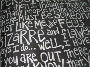
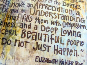
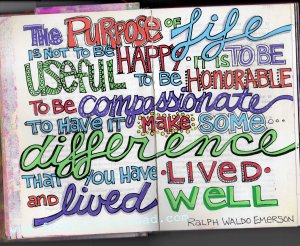
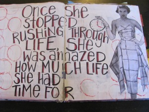
THICKEN – simply write out your letters in your own hand, then go back and thicken the letters. I like to add a little flair at the ends. Scrunching the spacing so the letters and words fit tightly together helps too!
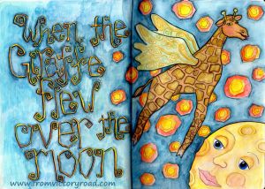
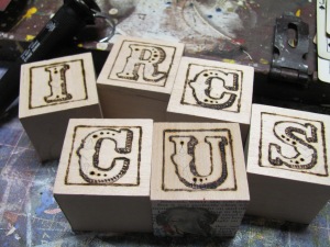
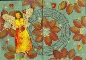
DOODLE, OUTLINE, & EMBELLISH – add curls, dots, and other fun stuff!
SHADE – the trick here is to pick a side, and stick with it!
SHAPE – fit into a shape outline, or follow a curved line…or a box, or a circle
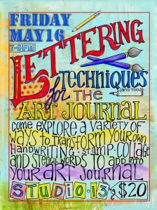
VARIATION – mix all kinds of styles and sizes together. Emphasize certain words
COLLECT EXAMPLES -study and gather fonts and type and words that you can adapt to your own hand. I have a Pinterest board full….both of quotes I like, as well as their execution!
http://www.pinterest.com/victoryroad/
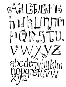
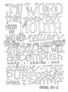
And here is a coloring page of letters for you, just for fun! Feel free to print and color!



Tammy Churchill
Thank you! Love that verse (and your blog!)
Kathy Hunter
Kayann, your talent and charitable nature has become a bright spot in my artistic journey. So very grateful to have you near and dear. Someday soon, I will make it to one of your workshops. I will!!!
victoryrd
Look forward to seeing you soon Kathy!
Dorothy Kovak
This is wonderful. Thank you!
Heather D
Thank you for this post…I’m inspired to experiment with my writing/printing. And thank you for the Isaiah quote. I enjoy your blog.
victoryrd
Thanks!
papict
Thanks for this. Typography is something I am having a bit of a tussle with. Pressure of time means I keep resorting to just a more controlled version of my own handwriting. I am hoping to have some time soon to play and experiment.
victoryrd
I practice on my shopping list, when I take notes in a class, while I am on the phone….Have fun with your letter play!