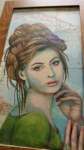
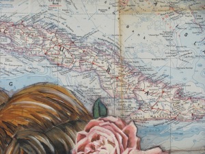
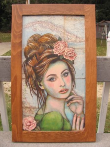
Starting with a cabinet door, and an vintage 1954 map of the West Indies, I set out to create a piece that has been on my mind for several months.
I love this old map, and decided to embrace the folds and stains that it shows.
As I started working on it, I made a shift in direction. Originally, I wanted to add a bunch of hardware into her hair….but somehow once I painted the face, it just seem too soft and gentle to fit the more grunge appearance I had set out for. So, as so often happens, I let the art lead me where it wanted to go.
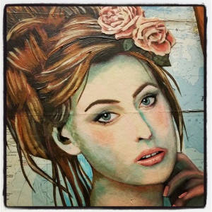
I added used a turquoise blue to shade her face so it would kind of tie in with the map behind her. I have really been working on faces. Sometimes they turn out, and sometimes they don’t! They are a bit mysterious to me… but I will keep working and improving. Keeping loose is a real challenge, especially when working with collage.
I found a wonderful wallpaper border full of roses, and I decided they would be a good accent in her hair, and in the corner. I painted over the roses with acrylic paint. Here is the filtered instagram version:
All done!
The original can be found at EcoFest. through mid October.


Laura (PA Pict)
Superb! I love the way the map ties into the colours used as accents in your painting. It makes it really coherent and visually pleasing.
victoryrd
Thanks! I love taking my cue and direction from the materials I using!
repurposingjunkie
Wow!! She’s beautiful! I love the detail you put into your art!
victoryrd
Thank you!
Carrie Lynn
Beautiful! I love how the total look she has pulls everything together.