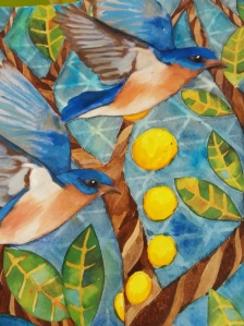
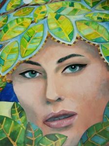
A couple of years ago, I painted this 20 x 24 inch watercolor that I called Flights of Fancy. I liked the concept, and an incomplete vision of it in my mind, but I was not wild about how the piece turned out. It was a bit too anemic, maybe a little too rushed. Not every piece is a winner… Since I still liked the concept. rather than discard it, I decided to attempt a redo.
I made the birds and the face a bit more realistic so there would be a contrast with the fanciful and whimsical surroundings. I made the background darker and added a ghost of stenciled image. I added more leaves to the tree, and around the woman’s face. I added some shading to the tree, and a little bird snuggled into the leaf “hair” of the woman.
So what do you think? Which do you like better, the original watercolor, or the new mixed media version?


Connie
Wow!….Wow, Kayann! I love watching the progression of your work. It is clear that God’s gifts are at work within you!
victoryrd
Thanks, Connie!
Laura (PA Pict)
I much prefer the new version. The stronger colors work more successfully to differentiate the spaces and patterns and the shading adds dimension. The original piece was lovely too but the reworking takes it to another level.
victoryrd
Thank you Laura!
Julie
Both are lovely! I vote for the mixed media version!
victoryrd
Thanks!
kthrow
This is like asking “what’s your favorite candy”!! Both stand on their own, but the transformation of the girl, the background is nothing short of stunning!
victoryrd
Love that analogy! Thanks!
StarS
Wow!
victoryrd
Thank you!