In the early 1900s, an international group of artists developed a style of abstraction that pared images down to basic straight lines, rectangular planes, and primary colors. Piet Mondrian was perhaps one of the best known artists of this movement. His experiments with Cubism evolved into abstract works that eventually came to be expressed with simple intersecting lines and shapes filled by primary colors only.
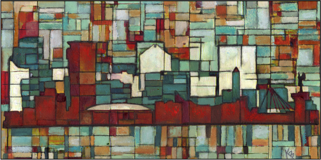
While Mondrian’s art isn’t what I would hang in my home, I do find the idea intriguing. What if I worked backwards and brought a measure of realism back into the grid? Today I am going to take you through my process of creating artwork that follows the idea of the strong use of line, but with softer, less precise lines, and a wider array of subtle color shifts. I call this style ‘Gridworks’ because it is a wonky and irregular representation of a grid as you would find on a piece of graph paper. It is irregular because the lines are interrupted as they cross the page and misaligned with one another. I also work with a variety of media as I created ‘grids’, including paint, paper, chalk, oil pastel, and more!
1. To get started, choose a general background color, and select squares of paper to glue here and there on your surface, partially overlapping some. I like to keep things square with the edges of my surface (i.e. parallel and perpendicular to) but otherwise don’t worry about how things line up.
2. Using a Stabilo pencil, I start sketching in lines. Make sure that most lines do not extend across the page. I make exceptions for lines that mark a horizon, or other compelling reason to do so. Keep your rectangles fairly large at this point, around 1 inch or more. You can go back and work smaller later if you choose to do so.
3. Once you have roughly laid in your ‘grid’, draw or trace in your subject matter. Anything that is recognizable in silhouette form will work. I prefer images that are more angular, but other images can work too.
4. Now start making a distinction between the inner squares, and the outer squares. This can be a difference in either size, or in color, or both. Do keep things coordinating though, and make sure at least some of the lines overlap the borders of the image.
5. Now you are ready to go back to your squares, making more refined color decisions as well as adding more lines, making more variation in rectangle size.
6. As you work on your central subject, you can start defining shadow and shape. As you do so, be sure and maintain the look of the grid, keeping your shapes very simple.
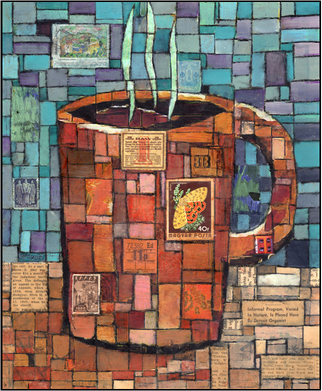
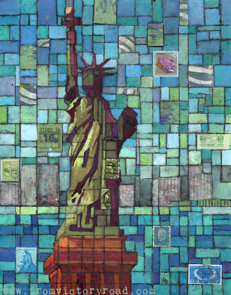
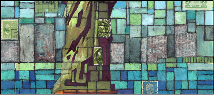
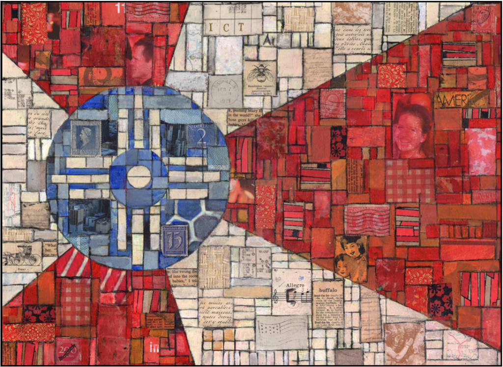
7. To the paint, I love adding fun little bits of paper, like postage stamps, tags, words, and other interesting little bits. This is where you can really add to the story of your piece. For example the use of international stamps in the Statue of Liberty artwork. Look for ways to contribute added meaning.
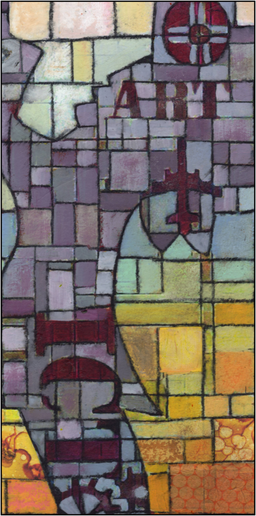
8. Once the grid is pretty well defined, start adding in chalks, oil pastels, and water soluble crayon to add rich visual texture to the piece.
9. Spritz with water to activate the stabilo pencil, and dab dry with a rag or paper towel. Touch up with paint or other mediums as necessary.
10. To finish the piece, spray with a workable fixative, then mount to a board with matte gel medium, or mat and frame under glass.
What do you think? Will you give it a try?
Lisa Jones
Great tutorial Kayann, will definitely be giving this a try! Love your artwork!
Kayann Ausherman
Thank you! Glad you enjoyed it