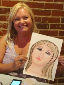
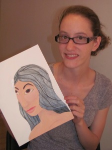
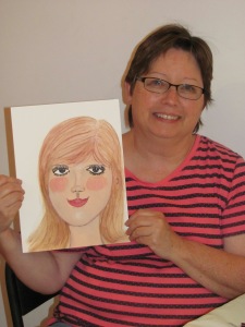
Last week I taught a workshop at Studio 13 on creating a face for the art journal. We talked about how the goal is expression, not realism. These do not need to be an exact representation of anyone, but rather a representation of our thoughts and ideas. If we are feeling a little out of whack, then the face on our page might be a little out of whack too! But, it helps to know the basic layout of the face, even if we decide to change it up a bit. So, in our workshop we talked about the pretty face. Not realistic, but pretty without spending so much time that we never get our journal page done!
First, the basic face layout:
We followed Jane Davenport’s example of using a Prismacolor pencil to do our sketching…no smudging, and no erasing! After we had the initial sketch ready, we started to flesh things in. After a solid first coat, we started adding a bit of white to the high points like the bridge of the nose, the cheek bones, and the brow ridge. Then we began to darken the dark areas.
We used Ceramcoat “fleshtone” and “touch of pink”, with shading done using Derwent Inktense watersoluble pencils. Still using our book page palette!
We kept adding and sketching and painting until our lovely lady was finished!
And, as always, best of all are the happy faces (both the real and the painted ones!) at the end of class.


Kathy Hunter
These students have a great teacher!!!